This week I was playing around with my old theme — Neve — and made some tweaks.
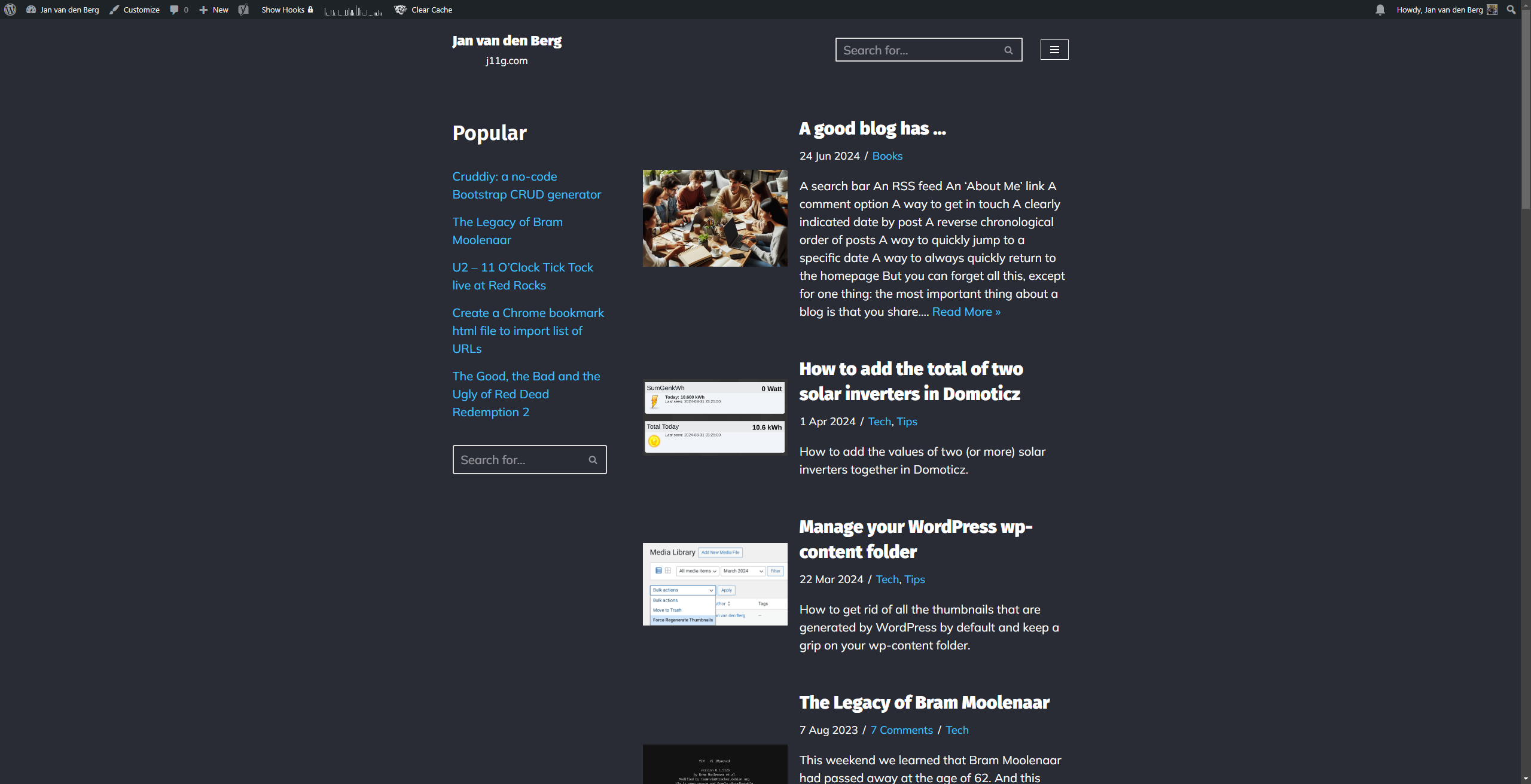
For posterity, it looked like this:

This site has low volume posts, so I was trying to get a list of posts as my frontpage. But it didn’t really look like I wanted, so I left it.
Yesterday WordPress 6.7 was released with the new Twenty Twenty-Five theme, so I thought: why not try this theme.
After all, this site is my playground, I can try out new things.
And the newer WordPress themes use the block-editor for editing themes, which is a new way of doing things. Something to learn!
Twenty Twenty-Five theme
So you are now looking at the default Twenty Twenty-Five theme with a few minor tweaks:
- Search bar at the top
- List view: all posts are visible from the homepage
- I disabled the Related Posts plugin
- I removed header images for posts
- I changed the favicon
- I added two small pieces of CSS. One to show the fan favorites with a ⭐ and show book posts with a 📖.
li[class="category-favorites"] .wp-block-post-title a::before {
content: "⭐ "; color: gold; /* Change the color if needed */
font-size: 1.2em; /* Adjust size if necessary */
margin-right: 5px; /* Adds spacing between the star and the title */
}
Overall I wanted a clean, tight look.
- I made no changes to the Typography (Manrope / Fira Code)
- I use the default color palette
- I removed all menus, except the About page. Every (old menu) link is accessible from this page.
The things I need to figure out:
- The space between the header and the post: but this seems more a problem on the desktop than mobile
- The search returns complete posts: I would like to return just post titles.
Overall, it is fast and clean. I like it.
Leave a Reply