Frequent visitors might notice a change to the site: I switched WordPress themes.
I have been a happy user of the Independent Publisher theme since this site started, and I still use it on my other blog. It’s a terrific theme and I like a lot.
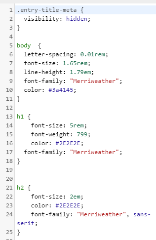
But because I really like clean and simple aesthetic I made quite a few tweaks to it, specifically to the fonts and CSS.
My favorite themes are usually black and white themes. Two of my favorite examples of this aesthetic are https://kevq.uk/ and https://blog.pragmaticengineer.com/. Both excellent looking sites in my opinion, and a joy to read.
So I looked closely at those sites and copied a few things from them. For example: both use the gorgeous Merriweather serif font as the main font for the body text. So did my site (this wasn’t the previous theme default font). I really like serif fonts, they add a sort of legibility and make big text blocks more readable.
But I always kept tweaking the theme: letter-spacing, font-size, colors and more, and I was never 100% happy with it. Especially when things looked good on the desktop, it would look a bit off on mobile. Or the other way around.
Neve
Last week I came across this tweet for a new theme called Neve from ThemeIsle and the example was striking enough to give it a try. And I was happily surprised but how easy, complete and fast this theme was out of the box. I have made exactly 0 CSS tweaks to it. What you’re seeing now is default Neve. I have tried *many* themes over the years, and always most lack something. Neve checks all the boxes for what I have been looking for, for quite some time.
And even though Neve uses sans-serif fonts, I found this theme to have the most overall consistent experience (desktop and mobile) and the configuration options are plentiful. And it’s really fast: which is really important. My site feels snappier because of it.
So I made the decision to switch themes. And I like it a lot. The last couple of days I go to my own site, revisit old posts, just to see how they look and I am always pleased with the appearance. The line-spacing is just right, the header font-weight perfect, it looks good on dektop and mobile, it’s clean and it’s fast.
Gripes
There are two gripes.
- I noticed when you don’t center an image, the image caption will sort of blend with the text. And it will not really be clear that the caption belongs to the image. The fix is easy though: center your images and the caption will be centered. Another solution could be to make the caption font smaller or use a different shade of grey to make it more distinct.
- The other gripe is one I have to examine a little bit closer, but I don’t think the Neve quote blocks look all that good. If anything a good quote might be best served by a serif font to stand out a bit. But, this is by no means a deal breaker, but I might take a closer look at this.
But also I don’t want to tweak too much. I actually really like that I can use this theme with default settings and that it looks really good. So if you’re looking for a great, clean, fast theme: give Neve a try!

